Adds UI Component
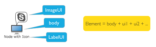
Looking from appearance, each graph is comprised of one main part and several children components. The node is defaulted to demonstrate one icon and text. The icon here is the main part of node, and one path for the main part of edge.
Mount child component
Except default graphic element, more child components may be mounted by the method of node.name = ‘qunee’. Each component can indicate specific information. Connect the graphic property and the child component, to realize the interactive effect of data
#addUI - add child components
Example
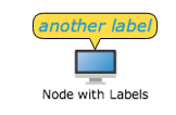
Adds the text label to the node. And bundle contents and font color of label in this text with node user
property. Change the content and color by changing node properties
var nodeWithLabels = graph.createNode("Node with Labels", 0, -110);
var label2 = new Q.LabelUI();
label2.position = Q.Position.CENTER_TOP;
label2.anchorPosition = Q.Position.CENTER_BOTTOM;
label2.border = 1;
label2.padding = new Q.Insets(2, 5);
label2.showPointer = true;
label2.offsetY = -10;
label2.backgroundColor = Colors.yellow;
label2.fontSize = 16;
label2.fontStyle = "italic 100";
nodeWithLabels.addUI(label2, [{
     property : "label2",
     propertyType : Q.Consts.PROPERTY_TYPE_CLIENT,
     bindingProperty : "data"
    }, {
     property : "label2.color",
     propertyType : Q.Consts.PROPERTY_TYPE_CLIENT,
     bindingProperty : "color"
    }]);
nodeWithLabels.set("label2", "another label");
nodeWithLabels.set("label2.color", Colors.blue);
Effect
Extend UI component
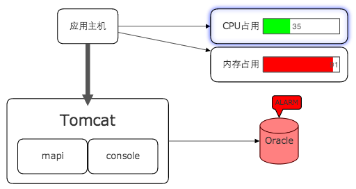
Realize rich effect by extension of child component, such as customizing one bar graph, mounted to a node, indicating CPU occupation ratio, or mounted to the status of warning and bubbling marked node.